Web Page Builder: How Tables, Columns and Rows Behave on Mobile Devices
Link: https://support.brilliantdirectories.com/support/solutions/articles/12000078399
The admin of the site can use tables within Froala editors to add content and style to static web pages on the site.
Sometimes, a table can look good on desktop view but when you see it on mobile devices it doesn't. That's why here we are going to explain the behaviors of tables on mobile devices.
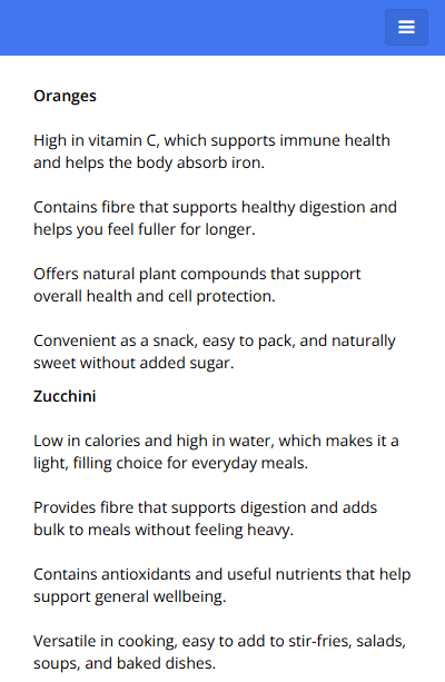
For example, we have this table in the Froala Editor, it has 2 columns and 5 rows:
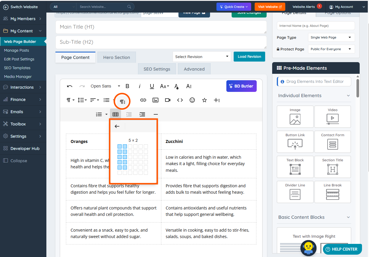
Desktop view
2 columns and each row show up correctly:

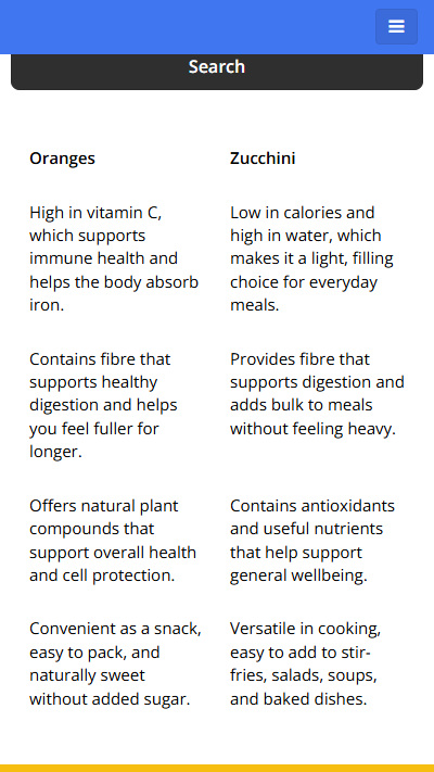
Mobile view
One column and rows are merged:
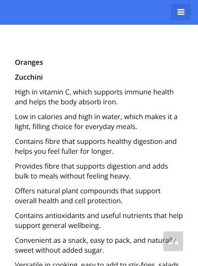
Even though the data is not being displayed in columns on mobile, this is how tables work by default. So in order to show the content correctly on mobile, there are two options:
Option 1
Create a table with one row and two columns, then add all the content inside these 2 rows:
It will appear like this on mobile devices:
If needed, ask BD Butler to place the table columns side by side for mobile devices:
or ask BD Butler to create a more polished table design: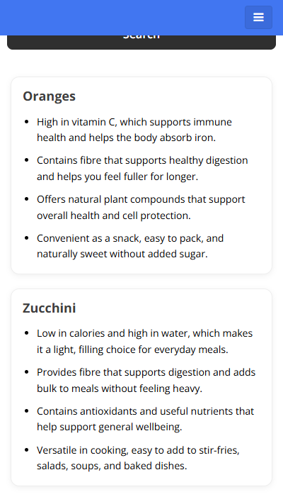
NOTE:
Make sure the content has the same number of text lines on the left and right sides to prevent extra white space on mobile.
Also, set Vertical Align to Top:

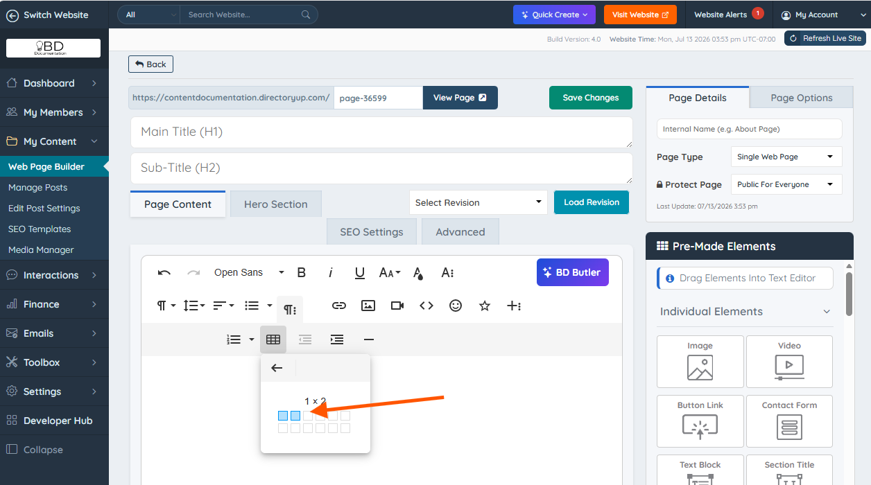
Option 2
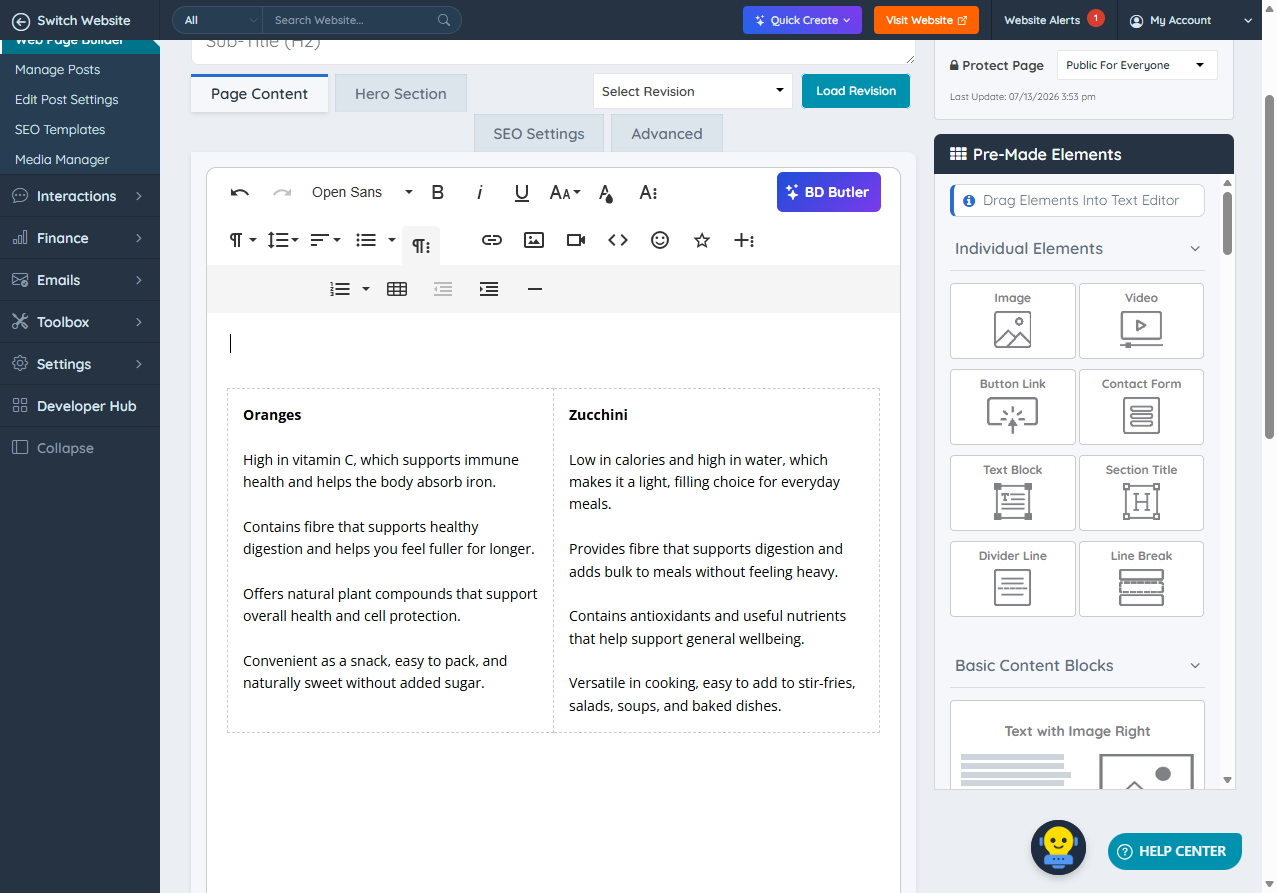
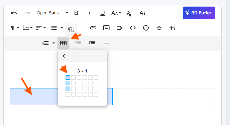
The second option is to create a table with 2 columns and one row:
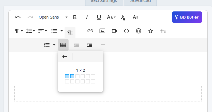
Click inside the left column and then click on the "Insert Table" button to add 4 new rows:
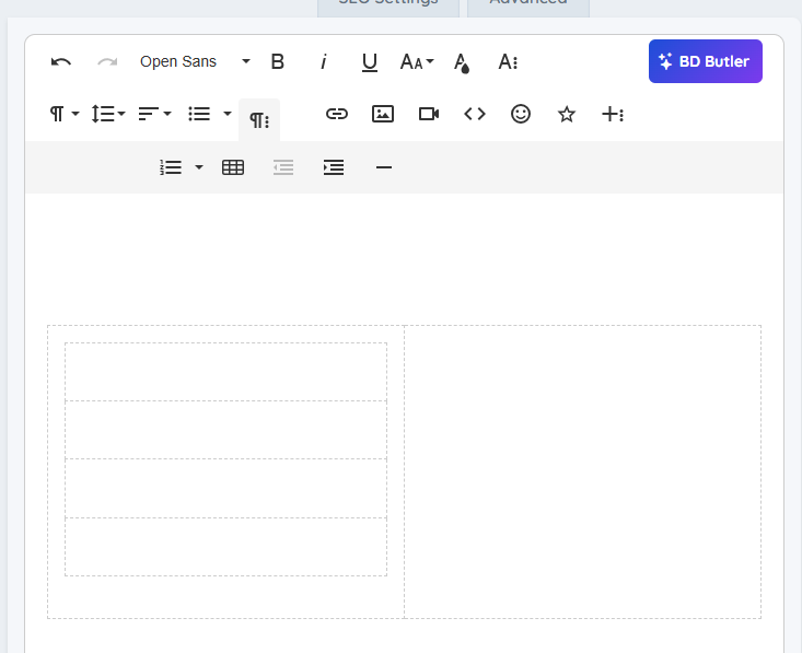
It should look like this (See the screenshot below).
Please do the same with the right column
Add the content on each row and column:

It will look like this one mobile:

NOTE: Ensure the text on the left and right columns has the same number of lines to prevent extra blank space on mobile.
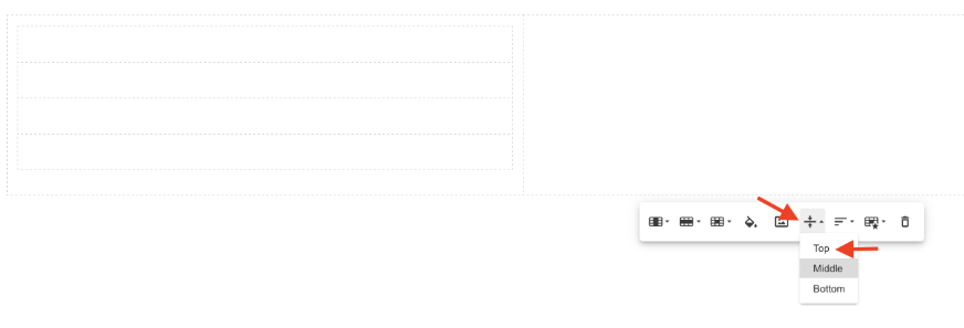
Also, set Vertical Align to Top.
To learn more about tables, please read this article: Froala Editor - Tables